Restoration Hardware Living
Oscar Wilde put it best when he said:
"Imitation is the sincerest form of flattery."
In the world of design, the best many of us can hope to do is to imitate great designers that inspire us. Of course, the second half of Oscar's quote continues with, "that mediocrity can pay to greatness", but that sours the message just a bit so let's focus solely on the former.
When trying to create a memorable space, there's nothing wrong with looking to those who do it well for inspiration. Throughout my years helping to transform people's homes for the purpose of selling, one brand has come up frequently; Restoration Hardware. RH is synonymous with quality and luxury in the world of furniture and accessories retail. Their pieces are stunning and the overall aesthetic is one part modern, one part elegant, and completely sexy. It's no wonder homeowners and agents alike reference the iconic brand when trying to convey how they'd like their spaces to look. The best way to try and recreate a space or overall aesthetic is to study images that inspire you. Having done a great deal of this myself, I thought I'd share a few ways we can all achieve the Restoration Hardware look when revamping our spaces.
Scale Up

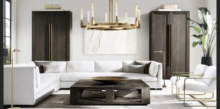
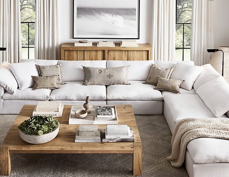
One thing you'll see in every RH showroom or catalogue is oversized pieces. From couches that can seat a small army to coffee tables the size of small cars, scaling up the primary furniture pieces in your space can help you achieve a luxurious look. Of course, your furniture can't be too big for your space, but it can and arguably should be as big as your room will allow for. Know your room measurements and always tape out the footprint of the piece of furniture you're considering to ensure it will work in your room. The same is true for rugs and artwork; bigger is better. The artwork behind your couch can occupy up to 80% of the wall space and consider going with the biggest rug your room will hold. You'll also see plenty of sectionals used so consider going with one continuous couch instead of a couch and loveseat combination.
Use Natural Fibers & Neutral Tones

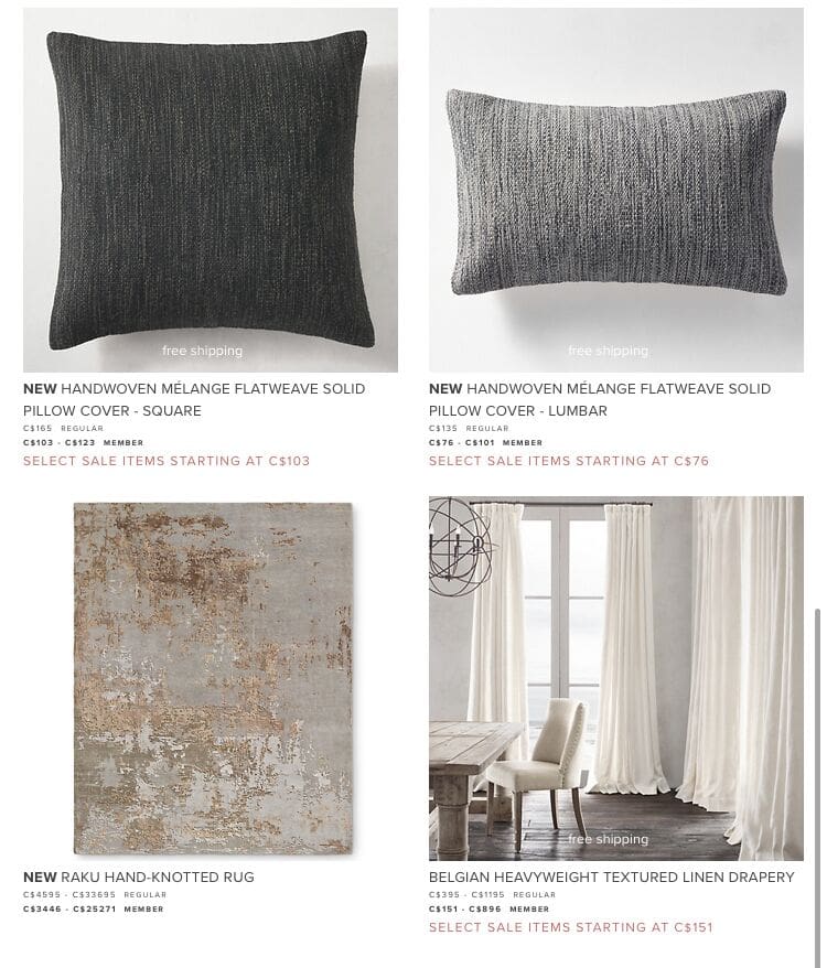
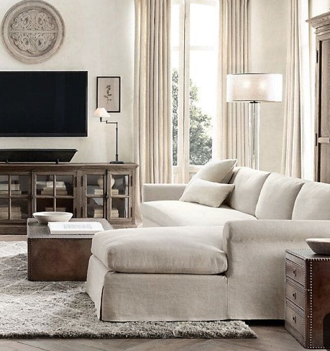
From wool rugs to wooden sideboards, and concrete tables, Restoration Hardware uses a lot of pieces made of cool, natural materials. While a concrete slab coffee table could be rather cold on its own, they manage to make their spaces warm and inviting through the use of layered neutral tones. You'll see lots of grey, off-white, cream, and beige without too much pattern for their upholstered pieces, and oversized black and white landscapes or abstract art for the walls. The rooms are almost always painted a neutral colour and you'll find floor to ceiling cotton curtains hanging in all of them. The layering of neutral colours keeps the space calm and inviting and lets the furniture stand alone as sculpture in the space. Adding fabric to the walls and pillows and throws in neutral tones to the furniture keeps the space from feeling austere while maintaining a chic and minimal esthetic.
Quality over Quantity- Rethinking the Tchotckes

Showrooms and staged homes differ greatly from homes we live in for one primary reason: stuff. Our homes are usually filled with things we've collected and like to display. If you're looking to move in a more sophisticated and modern direction with your space however, you'll want to start boxing up the tchotchkes and start living with less. In the very same way larger pieces of furniture often require that there be fewer of them in a room, your decorative elements should be slightly bigger with fewer of them on display. Some tips:
- Oversized bowls and gigantic coffee table books can adorn your surfaces, but only a few of them.
- Collections of small items are best tucked behind closed doors to keep the clean lines and simplicity of the space.
- Open bookshelves should be occupied by only a few books and will feature long linear pieces that take up entire shelves without creating clutter for the eye.
- Instead of arranging several items on your mantle, consider placing one or two sculptural elements off to the side with an oversized painting or mirror above.
There should be an obvious focal point on just about every surface without the need for the eye to wander from object to object. Unlike furniture placement in many of their rooms, decorative elements shouldn't be symmetrical. A sculptural element on one side of a sideboard does not need to be balanced with another similarly sized item on the opposite side. There's a sophistication achieved when decorating without obvious symmetry. The best way to recreate it is to study pictures of it that speak to you.
Condo Hacks

Of course, we don't all live in country manors with sweeping rooms or in penthouse condos with 1000 square foot living rooms, but that doesn't mean we can't achieve the same look:
- Paint your entire space a singe neutral colour to avoid any visual divides and hang curtains from the ceiling all the way to the floor to give the impression of higher ceiling height.
- If you never use your dining table consider extending your living room to incorporate the underutilized space.
- Your furniture pieces don't need to be oversized, but they can still be made from natural materials in neutral tones to achieve the same look, albeit on a smaller scale, and look for pieces that have legs to raise them up off the ground.
- Smaller spaces benefit from having couches and chairs with legs because they appear less visually heavy in a space.
- Takedown the busy gallery walls and replace them with oversized, serene, paintings or black and white photographs, and take away all unnecessary clutter to allow the eye to settle on single focal point wherever possible.
There is nothing wrong with drawing inspiration from an enviable source like Restoration Hardware, and it doesn't make your style mediocre as Wilde might suggest. The best design is informed from inspiration and perfected with the injection of oneself. Figure out what you want your room to look like, study some photos and see where it will take you. You just may end up inspiring someone else in the process.
Author: Kiel Storms. Read more about him here.
Source: https://www.upstagingto.com/achieving-the-restoration-hardware-look/


0 komentar:
Posting Komentar